Product Selection rework | Product design
Scaling from 3 to 9 products - without breaking trust
-
Redesigned the end-to-end product page at ManyPets, a pet insurance company, specifically focusing on the selection architecture and the display of policy details to improve clarity, trust, and commercial performance.
-
Insurance product was launching a full refresh of products that included growing policy offerings from 3 tiers to multiple annual limits within each tier. Users were confused and lacked confidence in their choices, leading to an initial dip in conversion. This redesign focused on adding clarity and ease to the journey.
-
I led the initiative as a full time Product Designer at ManyPets, from research to execution. I aligned stakeholders, facilitated cross-functional workshops, defended user-first decisions, defined the strategy and structural direction, synthesised research insights, ran all user testing, and designed the full comparison experience across web and mobile.
-
Improved tier distribution, increased AOV within tiers, boosted user confidence in purchase decisions, and eliminated complaints about “hidden” products - all without harming overall conversion.
Context: A High-Stakes Moment in the Funnel
As the primary designer for the distribution funnel at a pet insurance company (ManyPets), I owned the policy selection page - the most critical step in the purchase journey.
When the business decided to expand from three tiered products to nine and to introduce multiple annual vet fee limits within each tier, this page needed to scale without overwhelming users or hurting conversion.
This wasn’t just a UI update. It was a structural redesign of the decision making architecture.
On this page, customers:
see price for the first time
compare products and coverage levels
weigh cost vs coverage
decide if they trust us
convert… or leave
It consistently had the highest time-on-page and interaction rate, but also the highest potential for friction and confusion.
When Insurance Product redesigned our offering to align more closely with market standards, the ask was clear: “We need to sell more of the top-tier product.”
But I knew the real challenge wasn’t pushing premium products.
It was preserving clarity and trust while increasing choice.
The Real Problem
Adding more products sounds simple. It isn’t.
On the surface, the problem was: “We need to support more products.”
The real problem was: How do we increase product choice in a low-trust, highly regulated industry without triggering cognitive overload, decision paralysis, or conversion drop?
There were many strong internal debates. Insurance Product wanted to heavily promote the top tier. I argued we should prioritise selling what fits people’s lives, not what maximises margins. If customers feel manipulated, conversion may increase in the short-term but brand trust erodes over the long-term.
Pet insurance sits in a difficult psychological space:
emotional (protecting a pet)
financial (monthly cost sensitivity)
abstract (future hypothetical value)
complex (limits, exclusions, nitty gritty details, unavoidable insurance jargon)
low trust (customers assume details are hidden; insurance companies are duplicitous; and won’t be there when you need them)
Users don’t want to learn insurance. They want peace of mind. Preferably quickly.
And price anchors everything in the pet insurance world. From all the user interviews I led, one comment stuck with me: “I don’t care if you have the most beautiful and informative website in the world. If you cost me £100 a month, I don’t want it.”
So, offering customers more options risked:
Cognitive overload
Analysis paralysis
Reduced trust
Increased friction
Higher drop-off
More suspicion that we were “hiding something”
The challenge became:
How might we scale choice while reducing cognitive burden?
Ultimately, we aligned on the principle:
Clarity drives confidence. Confidence drives conversion.
Research & Behavioural Insights
Before designing, I gathered:
Previous research from our continuous discovery interviews as well as many past research projects on policy selection and decision making
Funnel metrics
Edit rates (how often users changed selections)
Journey analytics
Marketing and industry data
Metrics from other departments on pricing, sales, user uptake, and complaints
New usability testing on our current journey and approach
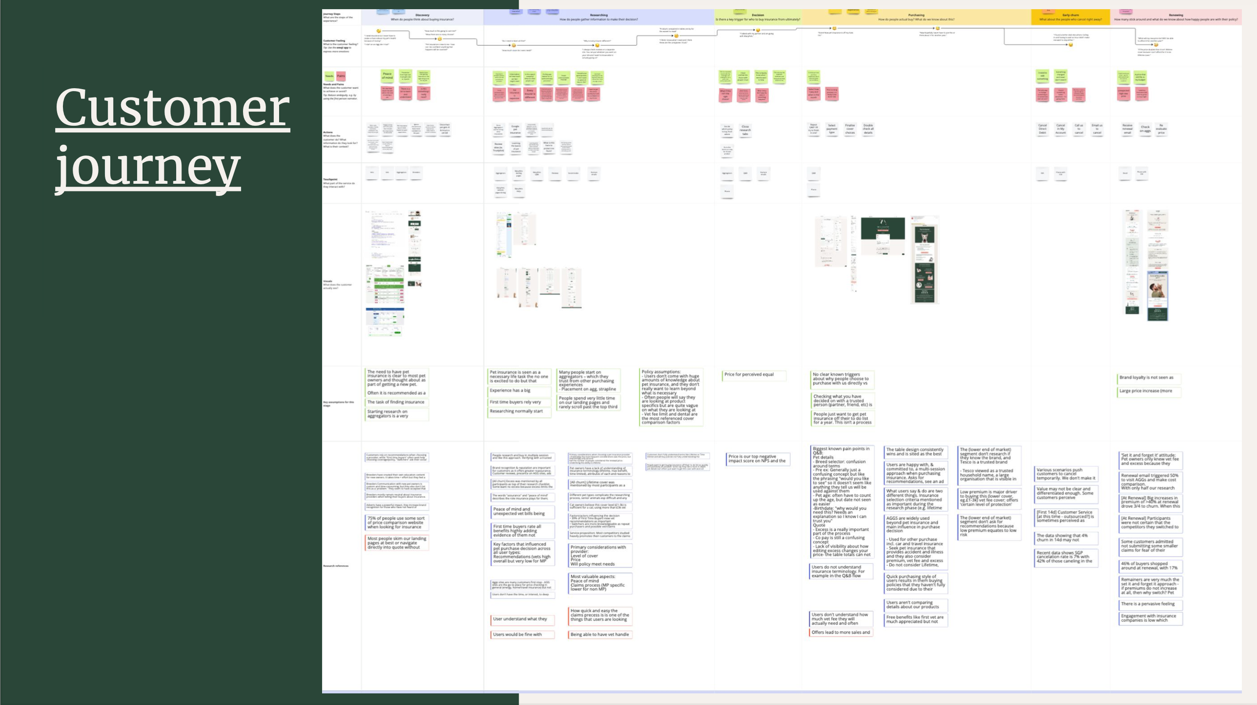
Clear themes emerged as I synthesised all this information:
No one wants to spend their Saturday researching pet insurance.
The gap between what customers should learn and what they will learn is large. No one wants to learn a bunch of industry jargon to get this chore checked off.
Trust is fragile and hugely important in this decision as pet insurance is an emotional purchase. Customers assume insurers are hiding details that will hurt them later.
Behaviours like clicking back and forth and calling in to complete a purchase highlight customer confusion when trying to figure out what to buy.
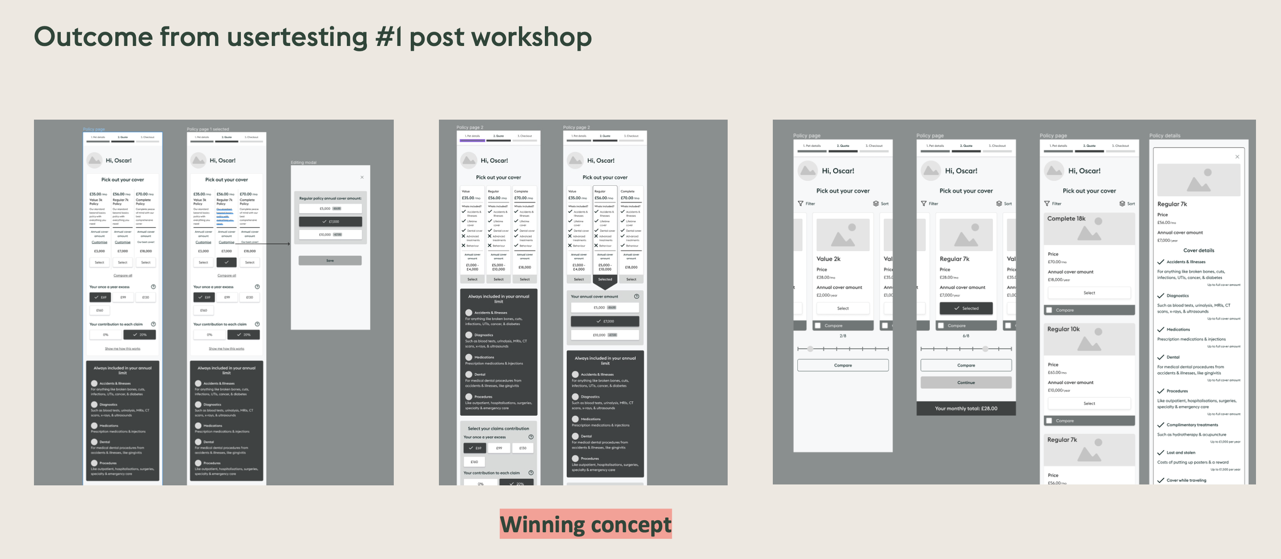
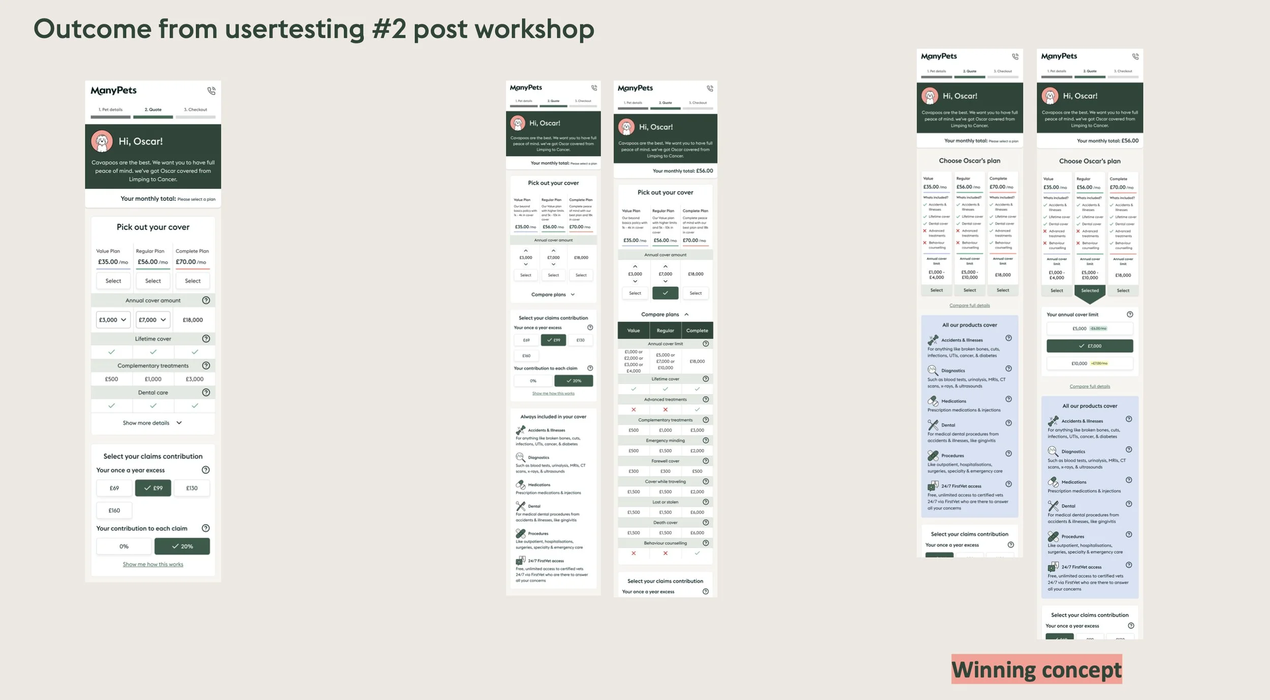
Gathering my key stakeholders, I guided us through at an ideation workshop. We explored many radically different solutions, ranging from stacked sequential flows to heavy table-first approaches, guided quiz-style narrowing to card-based comparisons.
Our workshop resulted in several radically different structural directions for product presentation.
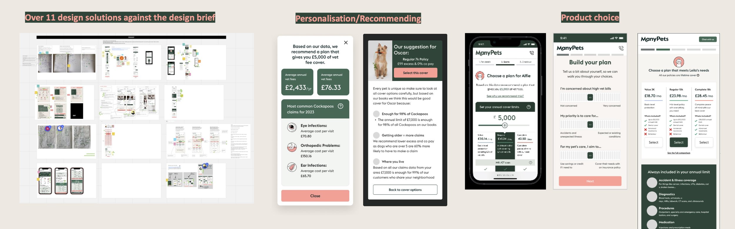
Rather than just choosing one internally, we selected our top three contenders based on what we knew about customers from previous research and I created fully functioning low fidelity prototypes and did a first round of user testing. Taking those results, I refined the designs and conducted a second round of user testing.
This iterative approach helped us:
Move beyond opinion
Reduce bias
Anchor decisions in evidence
Avoid investing development efforts in the wrong thing
Systems Thinking: Structuring Choice
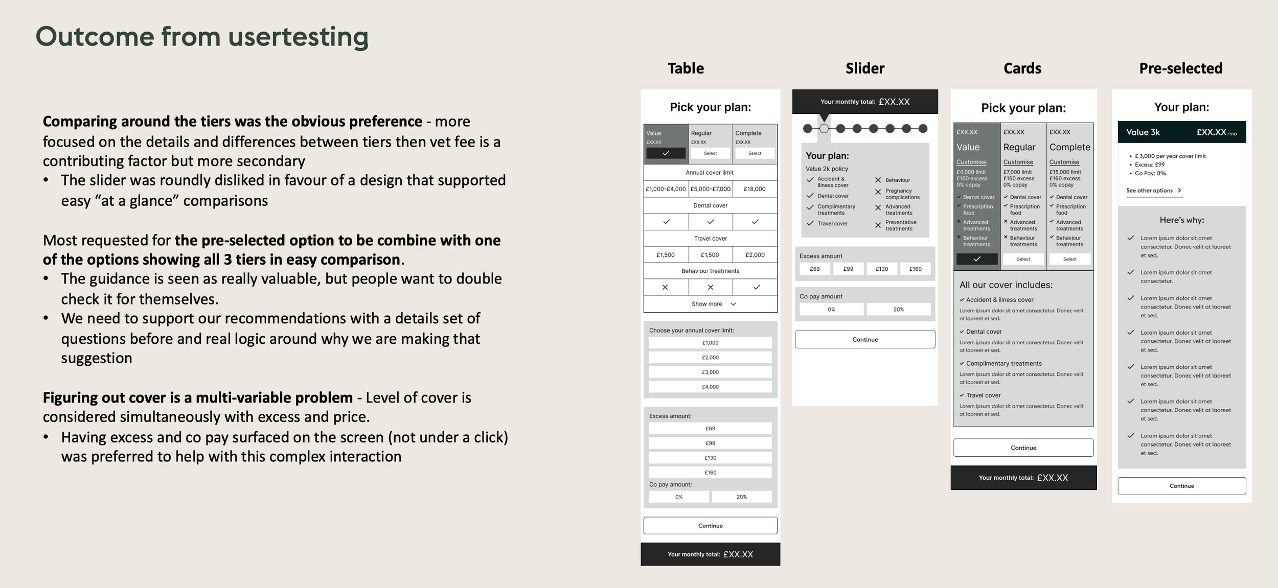
Testing revealed clear patterns. Users wanted:
Side-by-side comparability. Comparison at a glance was key.
A small set of highlighted differentiators between product tiers.
Full transparency and access to full details, but only when they were ready for it and chose to go deeper. Too much upfront information created anxiety.
Clear products they could trust. They did not want to build a bespoke policy from scratch or mess around with a bunch of optional add-ons. Structured guidance and leaning into our expertise was strongly preferred to DIY.
The other design directions were eliminated because they:
Required too much scrolling
Buried core differences
Forced sequential exploration instead of comparison
These were tough conversations as many stakeholders worried about the difficulty of creating side-by-side comparisons on a mobile device (over half our purchases were made on mobile), I strongly defended a comparison-first structure because the research results clearly showed its importance to our real users.
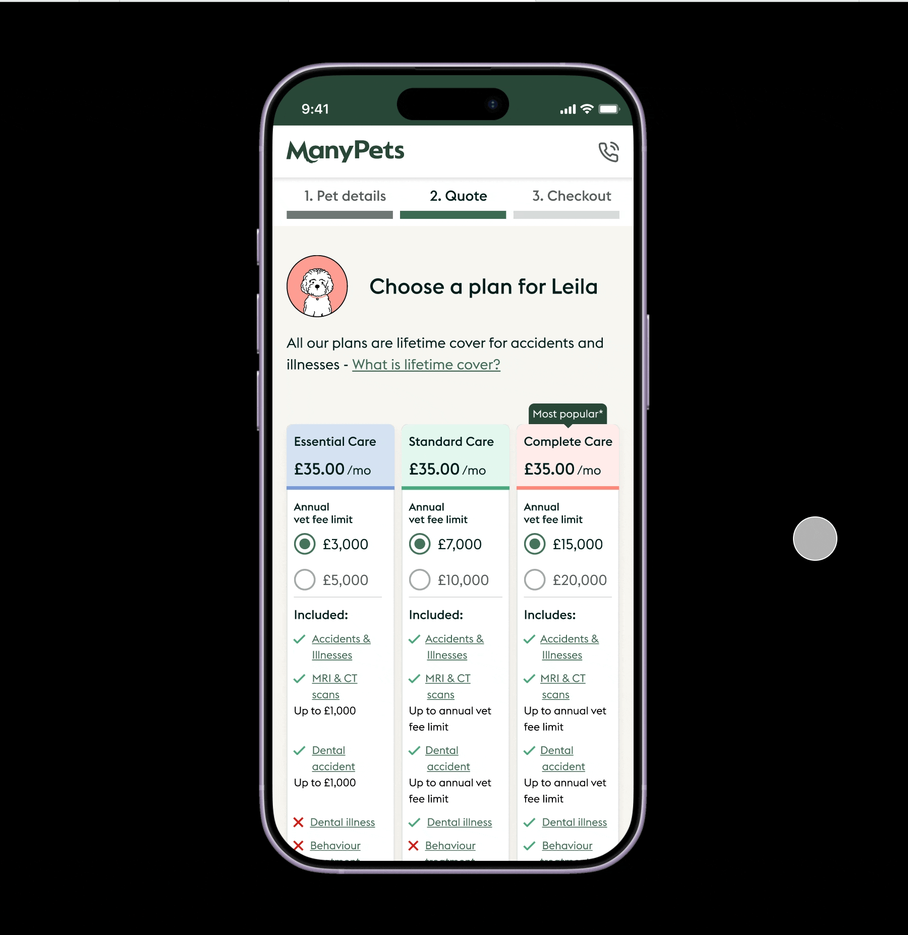
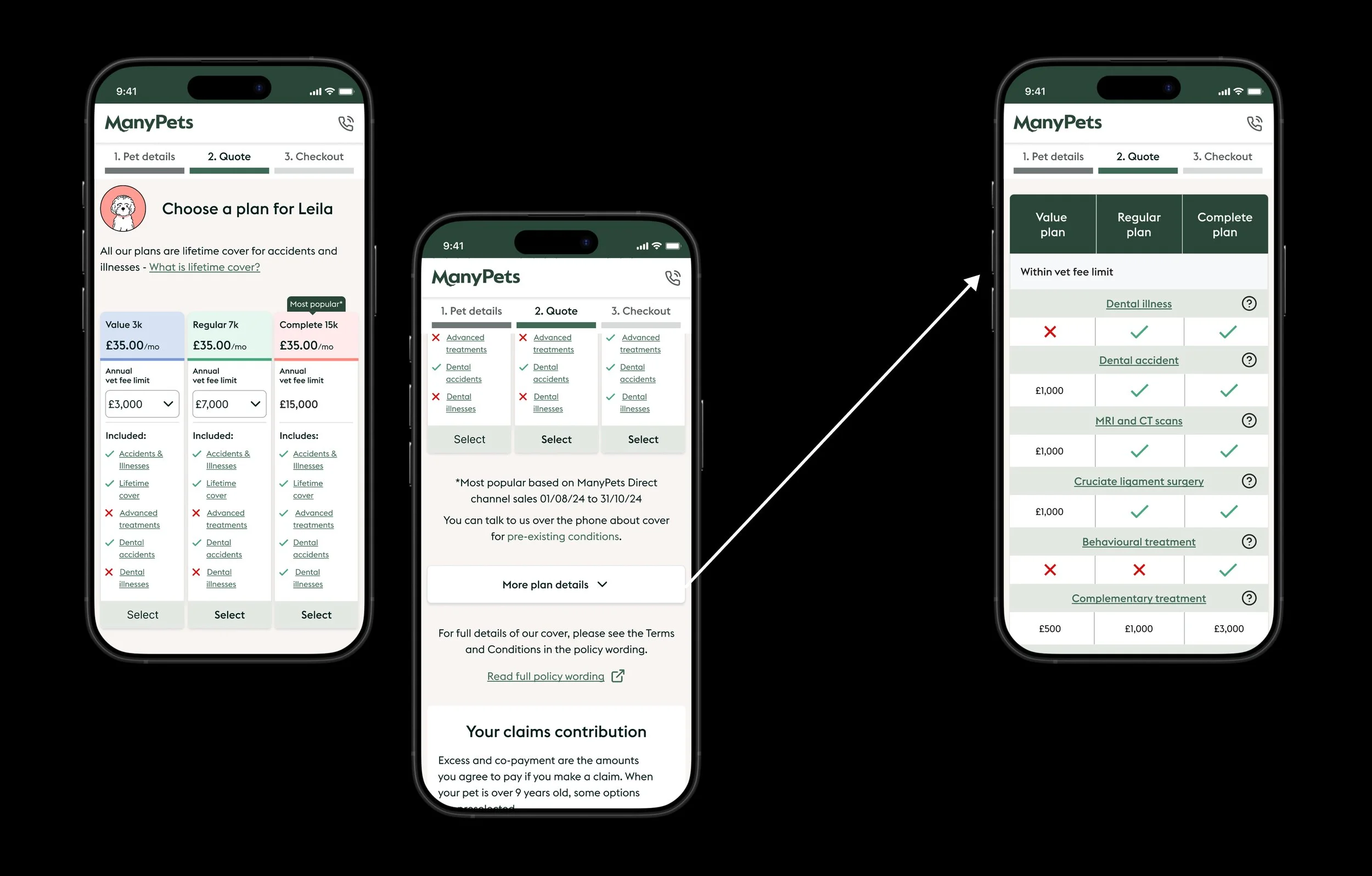
One of the hardest UX challenges was communicating that certain tiers included multiple annual vet fee limits. This introduced nested choice within grouped products. While we user-tested showing this as a second choice after choosing a tier, the strong user request was to see all the options at the top level and be able to easily compare all variations. Thus, our first iteration was implemented with dropdown selectors within each applicable tier, which users responded favorably to and described as “instantly understandable”.
The final structural approach:
Three high-level snapshot cards showing core cover differences
Selectable vet fee limits within relevant tiers that show real-time price updates
A fully transparent comparison table accessible on demand
This enabled us to:
Group products to reduce perceived complexity
Offer variation within structure
Allow for easy and quick comparison
Provide depth without overload
Maintain regulatory clarity
The mental model became:
Compare first → Refine second → Validate details third
Iterative Launch & Measurable Impact
Rather than launching a full redesign all at once, we broke the vision into iterative releases, A/B tested components, and measured our impact per change.
This made it possible for us to:
Defend decision with data instead of opinions
De-risk implementation
Provide clear impact attribution
Optimise continuously
Starting with changing from a table to a card, we saw:
A negligible impact on overall conversion, but given the overarching goal was to unlock the ability to add the complexity of multiple vet fee limits within each tier, this was classed a success. This highlights that although sometimes A/B testing is cut and dried, at other times it is more nuanced, and a flat line is a success when you are making such a large UX pattern change.
There were no increased complaints or calls to customer support to indicate additional confusion.
Interaction with the expandable table and modals for specific product information remained high.
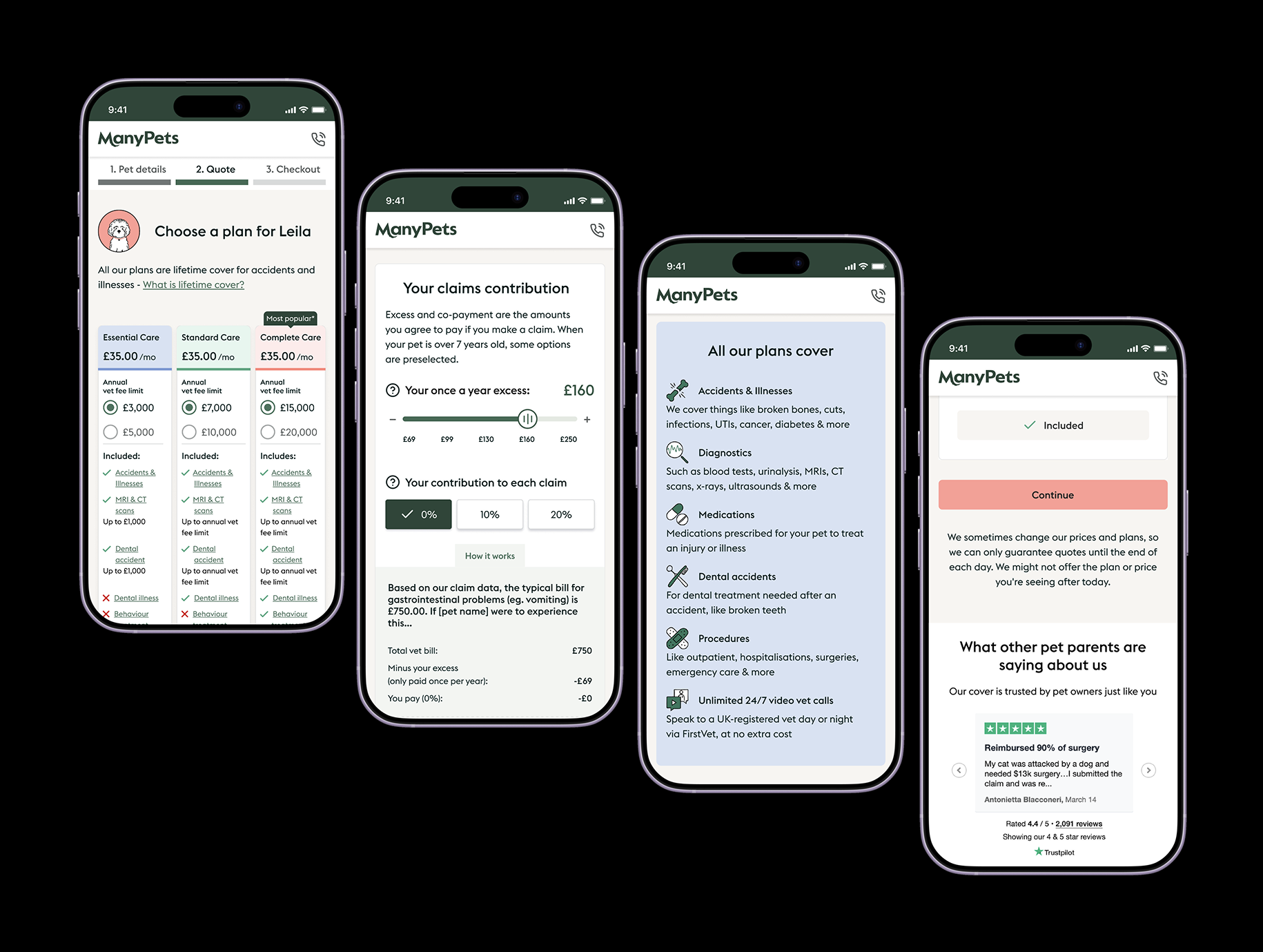
In the second release, the vet fee selection element was added.
We saw a positive impact on average order value and a positive trend to selecting higher value products.
Clicks showed high engagement with toggling between the vet fees.
In the third release, drop downs were changed to radio buttons:
In order to accomplish this, we had to remove some of our products as each tier did not have the same number of annual vet fee limits. This did not have a negative impact, and we selected the most popular products to surface on our direct journey and let the other products be aggregator specific.
Radio buttons led to even more interaction with the vet fee limits, and an overall increase in average order value.
At this point, we pulled the trigger on launching the new range of products in this new - and proven - structure.
What This Reinforced for Me
Insurance is not about features.
It’s about trust.
Customers assume insurers are hiding something. Our job isn’t to overwhelm them with information or options. It is to structure information responsibly. People want to purchase something without fearing hidden loopholes or surprise exclusions.
More features do not create more value.
Better structured information does.
This project wasn’t just about scaling products.
It was about:
Balancing commercial pressure with ethics
Designing for behavioural reality
Making complex, regulated products feel understandable
Protecting long-term brand trust while improving revenue
And doing it all in a way that worked on a 375px screen.